Posts by Diego Lafuente:

The new Tractis start page

We have a new start page! After two intensive weeks, we have finally launched the new way to enter and get to know Tractis. Each week we have improved every aspect of the application and I have to bite my tongue so I don’t tell what’s coming.

How it all started

When we first started out with Tractis, we had a start page similar to the one we have now. When I say similar, I mean that it had the same organisation of data as it has now: start session, tour etc.

At that time, Tractis was a closed project, only open to a group of beta testers who could invite anyone to join them. It was a start page a bit like a trailer of what would come later in August 2007. Our application, which was growing, had a darker look and feel than the current one and was the best we could do to invite people to discover Tractis back then, given that the number of DNIe (Spanish electronic ID) cards was low in Spain.

But later came the launch of the site in version 1.0. Tractis stopped being a beta, closed to the public and we began to offer the possibility of registration. We totally refactored the application; new sections, new conventions, new graphical style etc. We opened the application to everyone so that they could discover Tractis. We made the most of our knowledge, out standard way of programming so that Google would bring us an immense quantity of visitors who who register and use our application, mostly to share templates.
While the number of visitors rose considerably, it produced collateral damage which we identified: people began to think that Tractis was a site just for sharing templates. This is really untrue: we specialise in digital signature and, in addition, integration of digital signature and identity verification (authentication) services for third parties and if people only realise this by surprise, it doesn’t help us much.
Now that the DNIe is thriving, we wanted to promote the business tools we have so that Tractis didn’t end up as just a template creation tool. We designed a page with content functions for two concrete cases. This way we could transmit more information about the main function of Tractis to our new users in addition to other marvellous things: free smart card reader, API, new editor, digital signatures etc.

Production

We created many sketches with paper and pen. Later, the entire sketch is transferred to PDF with elements of our GUI kit and fantasy copy from the application used to give us a clear panorama.

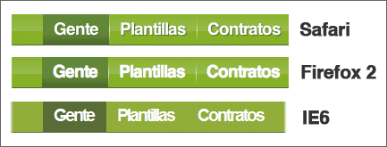
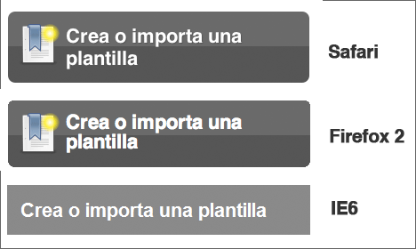
The code was the hard part, but it was entertaining creating a new page. We use a pretty popular slider called Coda Slider. It saved us quite a few hours of development but we, of course, had to get our hands dirty getting the slider working with the usage schema we have for Tractis: use cases, different quantities of tabs per use case, colours, contents etc. The coding and deployment work lasted about a week.

Another important aspect to consider when we talk about design and programming is the copy. Many people, myself included, forget to comment that this essential part of the development makes the project much more solid and gives it form. In addition it’s something so vital for us that in each new development we try to make the most of good copy with the design and programming so that no one feels lost in the application. The new start page, in addition, needs this: a clear explanation as to what Tractis is, what it is used for and the advantages of using it.

The result

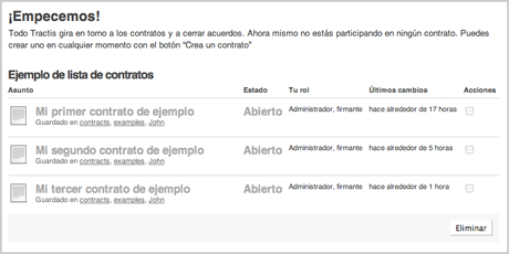
What you can appreciate today when you go to our address is a start page that has information produced exclusively for two types of users: those that are new to Tractis and habitual users. Each case has a set of information and tools.

home-en-non.png

The non-registered users can discover more about our main speciality: a tool to make and sign contracts online which remain valid in the off-line world, in addition to our interesting smart card reader promotion, registering with a single click, learning more about the Tractis API and more. Our main objective here is that people understand what Tractis is and that they register.

home-en-yes.png

The habitual users of Tractis don’t need to see all of this so we give them a box to start a session quickly and we describe on screen all the cool things that we are developing so that our users turn into power users. We want our users to make the most of the application. Knowing the details of the API, using the reader, understanding our tariffs, collaborating with Tractis and future functional innovations in the application. Our main objective in this case is that the user can quickly start a session and learns in a relaxed manner the new things that the platform offers.

Your opinion

We continue to be open to your suggestions, actually, we urge you to send us more because without doubt they are really useful. We know that we cannot make 100% of the people happy but we’ll never reject one of your suggestions. It is vital for a company that their users give them suggestions, even the crazy ones. For us, your suggestions, your comments – whether from the blog or using the “feedback” link in the application – give us a great feeling.

Until the next announcement!

By Diego Lafuente
Saved in: Announcements, Design | No comments » | 6 April 2008

HTML emails in Tractis

Have you seen the new HTML emails sent by Tractis? It’s the new cherry on the top of the application! We uploaded the change 4 days ago and the truth is that I’m happy with it. If your mail reader supports HTML you can see the mails in that format, otherwise you can view them in plain text.

The design

In design terms, creating a template HTML email is definitely not easy. If designing a web application is complex, due to the number of variants and versions, imagine doing the same for an e-mail program.

When designing the HTML emails I kept the following in mind:

  1. Simplicity
  2. Lowest number of images possible
  3. Personalisation
  4. Information

For sure, many of us have seen more than one HTML email. Personally I don’t like them. Primarily because 99% of HTML emails aren’t displayed quite right in the reader program and, in addition, because people read email from many different sources that don’t even respect proper HTML. So it is an arduous trial-and-error task (you can’t even imagine) to develop something universal. I tried to give the design the same characteristics as Tractis: Simplicity, bright colours, contrasts and good proportions.

  • Simplicity: The idea is that the mails are simple, both in design and construction. This allows flexibility to extend them or perform other operations.
  • Lowest number of images possible: Given that mail readers always block images, you have to be able to see the mail without images.
  • Personalisation: In the future, thanks to the code, you can insert the logo of the client and the colours of your theme.
  • Information: Structure especially made to transmit levels of information as desired. The first part allows you to see everything, the second is for those that require more information or want to read related information.

The structure

The mail has specific zones and this model can be extended as required. For example, when you want to insert bills, there are mini modules for lists etc. In the image below I’ve named the specific zones:
We have:

correo-html-en.png

  1. A Logo. A bit smaller in size that the original on the site. The Tractis logo is too big for a mail reader window.
  2. Identy line. It’s a design detail so that the design doesn’t ‘float’ and gives more emphasis to the subject. Ours has the Tractis green.
  3. Subject. A phrase that indicates the topic of the email.
  4. Summary. Serves to communicate the main message of the email. It is free to extend but the best proofs were those with little text. Less than 4 lines can be done but between 6 and 10 is best.
  5. Main action box. Accompanying the summary is the box with the main actions. This means the user does not need to search or read between the normal links that appear or also to show key information, for example (as in the image above) how much credit is available after ‘topping up’.
  6. Secondary information box. These are paragraphs to remind the user of the other options that are available in relation to the main action.
  7. Details module. A module that extends and has a large amount of information. In some situations, it will not be required. Allows the insertion of any content in the zone whether it is paragraphs or lists of items.
  8. Personalised list. A table in which you can personalise the information in a tabular form. In most cases it is used for payments, prices or perhaps to list versions or lists of concrete items.
  9. Additional information module. More information on the topic, such as penalties or actions related to the theme. Also includes contact information.
  10. Mail footer. Footer with contact information.

With this structure, we practically cover all the current needs for Tractis. I say practically because we never know what will come up in the future. Equally, the flexibility that it has demonstrated has been better then expected and has given few headaches.

What we hate about this

We wish that the code could be cleaner, shorter and standardised like in our web application. The problem originates with what the mail readers do and don’t do, impeding that possibility of standard HTML emails using separate style sheets. So, the code has to be an ‘alphabet soup’: everything included in the body of the document. When I look at is, there is too much superfluous code and even I can’t believe I’ve written it myself! But we’ve kept the abuse to a minimum to try and reduce the damage to our eyes.

In the future, when the major manufacturers understand this problem, we’ll change the emails to use less archaic technical standards.

By Diego Lafuente
Saved in: Announcements, Design | No comments » | 25 February 2008

Principle of degradation and its Application to Tractis

Few people will have heard the phrase: principle of degradation. It’s a term that has only recently come into use in web application development circles. When applied to web design, this principle means that a web site will ‘degrade’ in the most ecological form when viewed in old browsers. The basic idea is that all the material that is produced for a site is viewable when you use a non-standards-compliant browser. As we lower the browser version number, we will monitor the amount of technical support.

The truth is that a well degraded site allows a user with an old browser to continue using the features of a site in a vertical form without styles, effects or customisations for the specific version of the browser. A user on a mobile device that doesn’t support CSS can make the best use of the information if it’s well degraded. The images – related to the content – will continue to be visible while the ‘decorative’ images will move to the second or third level.

The Challenge

From the outset we have tried to implement this principle in Tractis. We designed to a group of standards and not for a specific browser vendor. Although we tried to support obsolete browsers, we realised that it was a massive amount of work and that we couldn’t provide the quality we would have liked to. Designing something for a specific browser only means that the site will look horrible in others. It’s best to tie yourself to principles such as this one in order to support a wide range of usage scenarios.

The Solution

The code required to implement this principle is not the simplest. First you program in various logical layers: XHTML for structured data, CSS for the display of each structure, JS to control the events. You should be able to see the page without any CSS support – that’s the goal. A user should at least be able to read what they have in front of them. If this rule is not kept, the degradation isn’t satisfactory and implies that a user is limited. As the user understands this, using more recent versions of the browsers, they will start to receive prizes: the site will start to appear as intended full of details which we call presents. For example, upon entering a site with browsers that support hte standard text-shadow property, they can enjoy the details and shadows that the application permits.

The Effect

If you want to see the principle of degradation in action, view Tractis using Firefox, Safari and Internet Explorer 7. At a glance, the main menu of the application appears the same in all three, but users with more standards-compliant browsers can enjoy additional details. Safari users see the menu as it was intended while those of Firefox, which still doesn’t have support for shadows, will see another view that is correctly degraded. The menu remains the same it’s just that it responds to the properties that the browser supports.

Some screen shots of the menu in various grades of degradation:untitled-1_03.png

Another excellent example of the principle of degradation is the shape of the action buttons. Depending on the version and brand of browser you use, you’ll see significant differences. Again: the full detail is available in browsers that support the standard border-radius and text-shadow properties while the rest will show it as they can, degrading lower and lower. En Safari, the buttons have rounded corners and shadows in the text, giving a button shape whereas in IE7 and Firefox, they change according to the capabilities of the browser: in IE7 the rounded borders don’t exist, giving the buttons a square shape and in Firefox, depending on the version, the borders are not as round as they should be.

untitled-1_07.png

Advantages for Tractis and our users

This principle benefits both us (as developers) and our users. We don’t work to Microsoft or Mozilla guidelines but to a set of standards and we consider it more important to have a high level of standards support than to support obsolete browsers. Our code is concise and fast. It is highly scalable compared to other projects and we can deal with many of the browsers that users might throw at us. Our users receive the benefit of code that follows the standards: high download speed, support, degradation, making the correct use of resources, and more.

The next time you navigate to a site and can’t use it because it’s not properly degraded, you’ll remember the standards and this post in which we talked about the principle of degradation.

By Diego Lafuente
Saved in: Design, Tractis | No comments » | 23 January 2008

Improved universal lists in Tractis

The latest version of Tractis contains better information lists. The new universal lists that we’ve developed bring a load of improvements in terms of both code and information design. In this post, I’ll summarize all the improvements that we’ve introduced:

Types of data used in Tractis

In Tractis, we deal with various types of information that need to be listed: comments, contracts, templates, people, signed documents, drafts, charges etc. The universal lists in Tractis allow the identification of each item by an icon that permits a user to distinguish between different types of item in the same list. All the icons used in Tractis are courtesy of the Tango project. You can see this in the screenshot below that shows documents that are both signed and still being edited:
listados-diferencias-r.png

Items are defined with a large font size compared to the other data. This allows the user to discern the importance of the information in a row. Many web sites define the same font size for nearly all the information. In Tractis we avoid this, reducing the font size of the information according to it’s importance. Primarily, in a large font, the name of the item, and second, using the same size, the state. All the states in the new lists have the same font size for quick reading. The smaller size is reserved for additional information that is considered secondary – optional in many cases.

One of the problems we found was that the amount of information we can show is restricted by the width of the list, meaning that the lists grow vertically. This limits a user’s ability to rapidly read the various items and means the list items aren’t of a uniform shape. After a thorough investigation, we found a way to hide the contents of a large item (using CSS properties) when it is out of focus, meaning all items are the same size. This helps enormously in the reading of the data, both vertically and horizontally.

Cell highlighting

Thanks to CSS, the lists have 3 states: reading, hovering and activated. The reading mode is what you normally see. It has no type of effect, and all elements are the same colour. In this state, there are no elements selected, and you’re not hovering.

listados-hover-r1.png

The hover mode helps a user locate their cursor in a big list of data. We use CSS here to give the row in a light blue colour, helping the user keep their cursor over the row. If we didn’t do this, the cursor could accidentally move onto another row and the user would end up losing the focus on the data they were interested in.

listados-active-r.png

Once a user performs an action or activation, the activation mode is enabled. The row will become yellow which will indicate to the user that they can perform another action – either with this individual data item or with various in the list. For example, in this row, 3 items in the list are active to accept the only action available in this module: delete. In the future, we will apply more actions based on the activation of items in lists, for example, so that a user could select 4 contracts in a list and edit their tags in batch mode or put the contracts in user-created folders according to the user’s organizational criteria.

Semantics of the lists

When a HTML developer has to create a list, the first thing that comes to mind is ordered or unordered lists. HTML lists are ideal in many cases but when they require multiple fields, it’s much better to use a HTML table and represent the data in a tabular format. Here is where factors such as the use of HTML elements such as columns, rows, headers and summary titles come into play. In Tractis, lists are in an independent module which can be easily included on any page. Such modularity is made possible by HTML elements such as CAPTION. All Tractis lists now have this element so that we can reuse the list without changing titles or modifying layouts.
Before, we used H3 and H4 titles for these lists, but this didn’t allow us to keep the data seperate from the tables in other sections, so we put CAPTION to be able to reutilize the tables without the need to go deleting or adding new titles.

Fantasy Lists

One of the developments that new users of Tractis will notice is fantasy lists. Many applications, when a user starts to use them, don’t show them a set of example data which complicates the way the users learn or get to know an application.

In our first versions, a new user would see a short piece of text that explained what they had to do but they never knew what would happen if they created a contract or template. What will appear here? What data will I see? We solve all these unknowns by showing example data. This allows a user to see the item that is created, what additional data they can add, how it’s ordered, what states it shows.

To do this, we looked at some examples, but they were limited. Many used an image with a watermark that said ‘example data’ which caused a few snags. For example. it only works for sites with fixed page widths. Since we have a multi-lingual site, we need to create screen shots in various languages which is unproductive. If (as is frequently the case) a list changes or an item is added to it, we’d be forced to do another round of example images, so we discarded this option. Also, if the connection fails and the image download fails, the user won’t see much. The level of intereactivity is low.listados-fantasia-r.png

What we did was to create a list with fantasy data, and when a user touches any of the data, a message appears inviting the user to create or operate with the application. This list has gray data, deactivated controls, is translated into all the languages available with Tractis and is flexible to changes of page or cell width and other actions that a user can perform with their browser.

Lists that are functional, universal and expandable depending on the context. We want to extend the user of the lists but we’re reticent right now to add more complexity – we believe that the amount of characteristics and functionality is not so important as the exact combination of actions we need to do to finish our tasks.

By Diego Lafuente
Saved in: Design, Tractis | No comments » | 12 November 2007

Appearances aren’t deceptive!

A few years ago I wrote about an interesting design theory that didn’t fit with the ideas of the time. It was about the separation of the presentation content and functionality in a web project. In Tractis, we followed this path from the start, which allowed us to layer the design well. For example, we separate the work of the programmers from that of the designers and those who manage the content. This allows us a higher degree of application personalization and customization than with similar applications.

appareance

Us mere mortals that don’t understand design patterns or methodologies can admire and enjoy the end result: Appearances (account required). Alter the colors of the application or change our logo for yours in two clicks.

So there you have it – in Tractis we’ve implemented the ability to change the application appearance using a simple form. It’s pretty easy to do and works well, with a few limitations. The basic idea is that anybody, with a small program that captures colors (for example Colorschemer [see online version]) can capture the colors of their branding or corresponding website and switch them using the Tractis user interface. But it’s not just that, you can also upload your logo (of certain dimensions) to put the icing on the cake. You can mix a lot of colors on the screen but the idea, and my recommendation, is that you use a few colors and based on those, construct a finished design. The application also allows you to change a specific value, for example, there’s no need to fill in all the fields in the form to see your changes – you can change all the greens at a stroke by only changing the relevant fields. In the case where you’ve modified a lot and you don’t want to record the values, we’ve left you a button to undo the changes.

In the near future, we really want you to be able to upload your own CSS, your rules, your colors (10 or 50), your images – instantly customize any part of the ‘look’ of the application. To accomplish this, we’re working hard to study and to set up the foundations of the application which you will see is now no small thing.

This is promising and I really love it! There are limitations, but in my tests I made many color schemes that were not bad but were not production-ready. I invite you all to do screen captures with your color combinations and try the new functionality.

This was one of the most fun programming tasks in Tractis, I loved doing it but, for the moment, I’ll take a break to do another major change to the application and make an application that’s a pleasure to use for work and to do business.

By Diego Lafuente
Saved in: Announcements, Design, Tractis | No comments » | 2 February 2007

GUI kit

Continuing with the posts on design, this week I’ll show you something you may like substantially: my IA development GUI kit to build wireframes. I’ve been using it for quite some time now and I can’t complain of how good it’s worked.

More than anything else, the kit contains form elements and other rapid prototyping things. I had thought of adding more things but it would have been whims in any case. If I place structures outside the forms, they’ll probably never adapt to the things that will be done.

It’s a PDF file. I usually use Illustrator to stretch, adapt, enlarge and change them. It takes me close to 5 seconds to give them the appropriate form for the wireframe and I do it all using three tools: Selection tool, Direct Selection Tool and Text Tool.

With those tools, I modify the structures.

The kit has CC Attribution license and you can do anything you want with it, provided that you state the source.

By Diego Lafuente
Saved in: Design | No comments » | 4 September 2006

The effects of tiredness

One of Negonation’s cool functions that I’ve seen in the last few days in the builds has been the change in the group name. Instead of calling yourself “party one”, you can now call yourself whatever you want; for example, “death group”. As I like playing with the app, I’ve called my negotiation group “Los villanos locos” (the mad villains).

Grupo de negonación

And when the effects of so much work happen, the villains write the following comments:

Comentario pirata

Those minor details make it more fun to negotiate.

By Diego Lafuente
Saved in: Pranks | No comments » | 3 August 2006

Design in Tractis

I haven’t written for a long time, sorry. With the deadlines and the blog, it takes twice as long, especially if I want to write something interesting. Today, I’m going to show you quite a few things regarding the application. This will probably be the only post you’ll see from me this month and next month, so I will take the opportunity to show interesting features.

First, let me tell you how it’s designed. I have been trying with user-focused design for around 7-8 years. This method, which is well looked-upon and is one of the most used and dominated by people in my field, is not causing the same effect nowadays.

Usually, when I observe interfaces designed with that method, I notice that focusing on the user is completely being misinterpreted. When I started, I thought that designing with that method was like taking a notebook and pen, listening to each user, writing down every “requirement” and every “whim” and, based on those data, including them in an interface. This is where humanity’s largest destructions in interface designs are produced, I remember thinking that some of the things I had designed had turned out like the car that Homer Simpson designed at his brother’s company.

As I was saying, this also happens when I only apply user-focused design. I tend to include all the users’ possible requirements, trying to standardize all of them. Anyway, to change the air a little, I have decided to take another route, which is equally directed and leaves me in the city without having to do much mileage: action-focused design.

Esquemas de metodologí­as de diseño

At first, people feel out of place when hearing this but the term has been bandied about for a long time and I’ve read some papers that examines it minutely, explaining more than anything else designs based purely and exclusively on action patterns.

It’s not bad. It’s the most specific that I’ve found so far and, together with the small doses of user-focused design, we can attain what many call “a complete software architecture”. A design based on actions and not on a user’s possibilities. In general, this distorts the application to non-existent levels. Try doing something small, and you’ll see that the application requires an interface that is “able to do everything” instead of doing certain actions well.

Our design process is perhaps quite different to that of other companies. To start with, I’ve always required following a development line that provides great flexibility, keeping within margins of error and ensuring that there are not many irreversible mistakes. To ensure this, our design pattern (see further below) follows very simple steps: apertura proceso > reunión de mapeo > prototipo borrador > presentación del prototipo > producción final > subida de material.

It’s not usual, at least for me, to see this in all companies, even in large consultants. They all pursue the goal because there’s no time or budget for applying those steps, which are nevertheless essential; since I’ve started to force myself to apply those steps, I wake up without many headaches. Getting to the point, I will show you some of the application in PDF so that you can take a closer look at the subject: how we create the prototypes, what they are, the foundations and the documentation for each project developer and collaborator. It did not take us months to do this; in fact, all that planning and production usually takes a week or two.

I hope you’ve liked this. You can ask about anything without any drama in the comments. We will try to answer, although we’re suffocating because of the launch dates.

By Diego Lafuente
Saved in: Design, Tractis | No comments » | 26 July 2006

Blog update

Some words are usually written at the end of each post with the name of the author. In general, this blog is written by 3 people: David, Manuel and yours truly. To inform the world of who spends their time in their job’s blog, when they could be playing cards in the local pub, I’ve placed the images underneath “who we are”.

Diego Lafuente Manolo Santos David Blanco

I know that this will not change the world and that Google will not buy us for this…but it looked so cute…

By Diego Lafuente
Saved in: Announcements | No comments » | 21 July 2006

Specialized blogs

When I give lectures on how to make money from a blog, I always end up giving the example that, in Spain and Latin America, this is hardly ever the case: a person who’s an expert on something writes about his/her specialty and is hired as a result.

Usually the person has a job, lives well from it and does not need to “pay hosting”, one of the most absurd excuses in this field. I’m not referring to commercial blogs either, dedicated to the world of legal news, where you can get bored reading a post. I’m simply referring to people who blog, who talk about what they do. Unfortunately, this phenomenon only happens in excellent doses in the US, where “payment for service” is the in-thing.

Continuing with the subject, finding specialized blogs from professionals who write about their subject and don’t digress to other stories is practically impossible. It looks like people are afraid of losing clients or stoking the competition. In the first case, for example, if I write about my subject, anyone could develop it (e.g. a contract editor), which would reduce the work. In the second case, the competition would be afraid of revealing talent for the benefit of others. But I believe that, in those cases, the best thing is a master at something; it’s difficult to sit down and write a document well, such as Wayne Schiess, or create an adequate contract, such as Ken Adams. However, both show their forms, without any restrictions, so that everyone else can learn and know. I believe that they’re both making money simply because they’re telling things.

I would like to see more of this in Spain, especially in legal matters, where the general public don’t have much idea. One person or more with talent in those fields, in terms of legal matters, composition, wording and negotiation, can have their own weblogs, create their business centers based on their services, and profit terribly from this field, which I compare with a remedy: everybody gets ill, so a pharmacy will never be a loss.

Wayne has a very entertaining weblog. He focuses especially on legal writing, which is not the same as what to write in a blog or that I start writing something when I lack the knowledge even if I have manuals explaining the subject point by point. But it’s interesting to know that there are many snags in the way we write a contract, especially if it’s for something big where often an incomprehensive text or bad writing can change the situation.
You should read blogs from people who work on this, in terms of both the writing in Spanish contracts and their composition.

By Diego Lafuente
Saved in: Blogging, Entrepreneurs | No comments » | 6 July 2006